PokéBattle
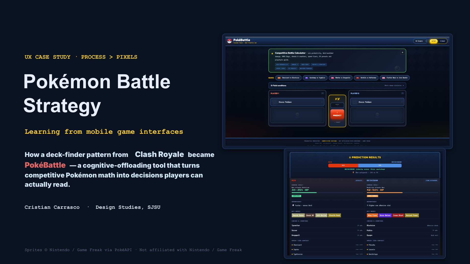
UX case study · cognitive offloading for competitive Pokémon
UX case study · process > pixels
Pokémon battle strategy, readable rules
How a deck-finder pattern from Clash Royale became PokéBattle — a cognitive-offloading tool that turns competitive Pokémon math into decisions players can actually read.
Game-facing prediction is credibility-sensitive — design for transparency of inputs, not just a winner label.
01 · The problem
Cognitive overload
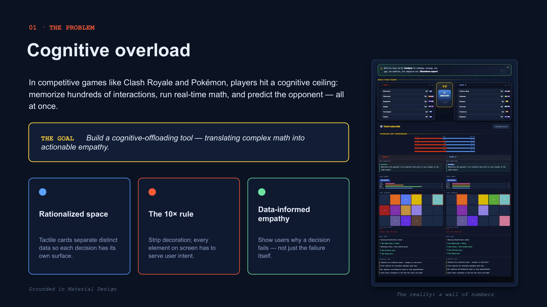
In competitive games like Clash Royale and Pokémon, players hit a cognitive ceiling: memorize hundreds of interactions, run real-time math, and predict the opponent — all at once.
The goal: build a cognitive-offloading tool that translates complex math into actionable empathy — rationalized space, the 10× rule (every element serves user intent), and data-informed empathy that shows why a decision fails, not just the failure itself.
02 · The framework
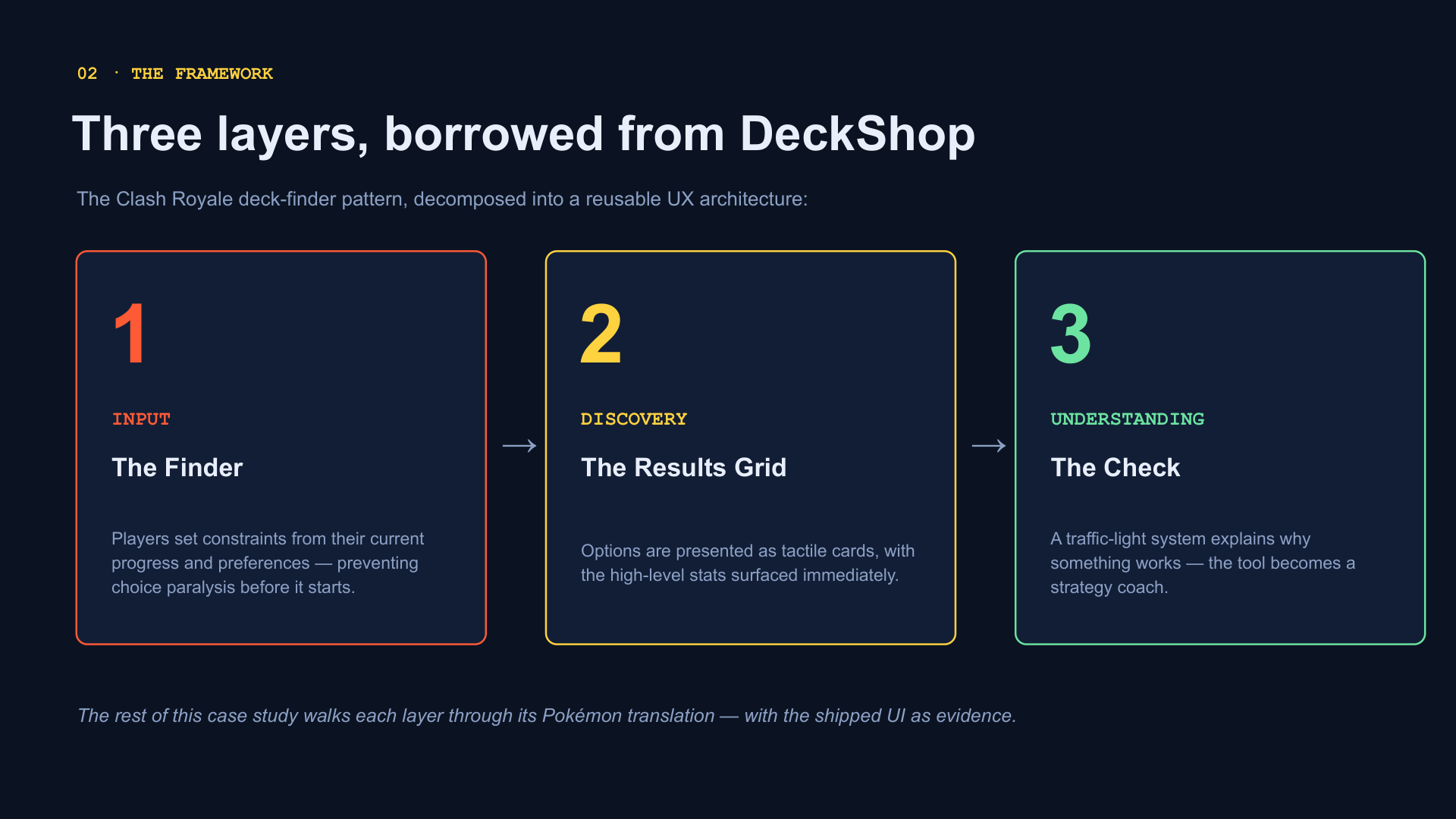
Three layers, borrowed from DeckShop
The Clash Royale deck-finder pattern, decomposed into a reusable UX architecture: Input (the finder) → Discovery (results grid) → Understanding (the check).
03 · Translation
Clash Royale has 8 cards. Pokémon has more.
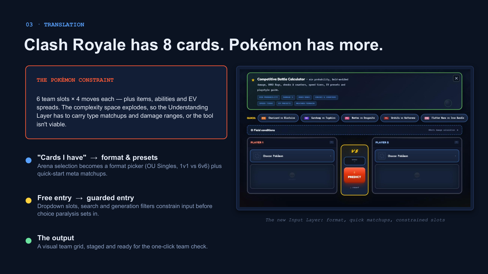
Six team slots × four moves each — plus items, abilities, and EV spreads. The complexity space explodes, so the Understanding layer has to carry type matchups and damage ranges, or the tool isn't viable.
- "Cards I have" → format & presets — arena selection becomes a format picker plus quick-start meta matchups.
- Free entry → guarded entry — dropdown slots, search, and generation filters constrain input before choice paralysis sets in.
04 · Discovery
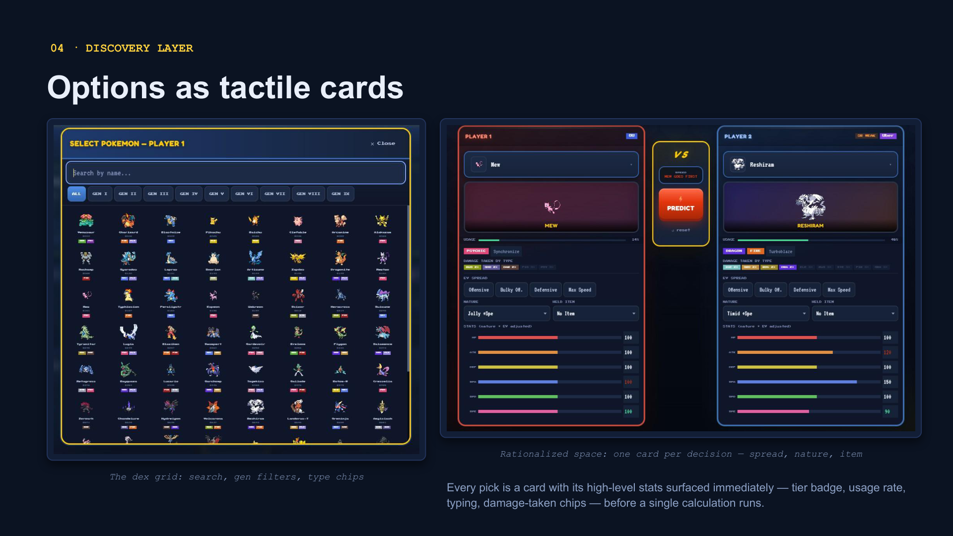
Options as tactile cards
Every pick is a card with high-level stats surfaced immediately — tier badge, usage rate, typing, damage-taken chips — before a single calculation runs. Rationalized space: one card per decision.
05 · Iteration
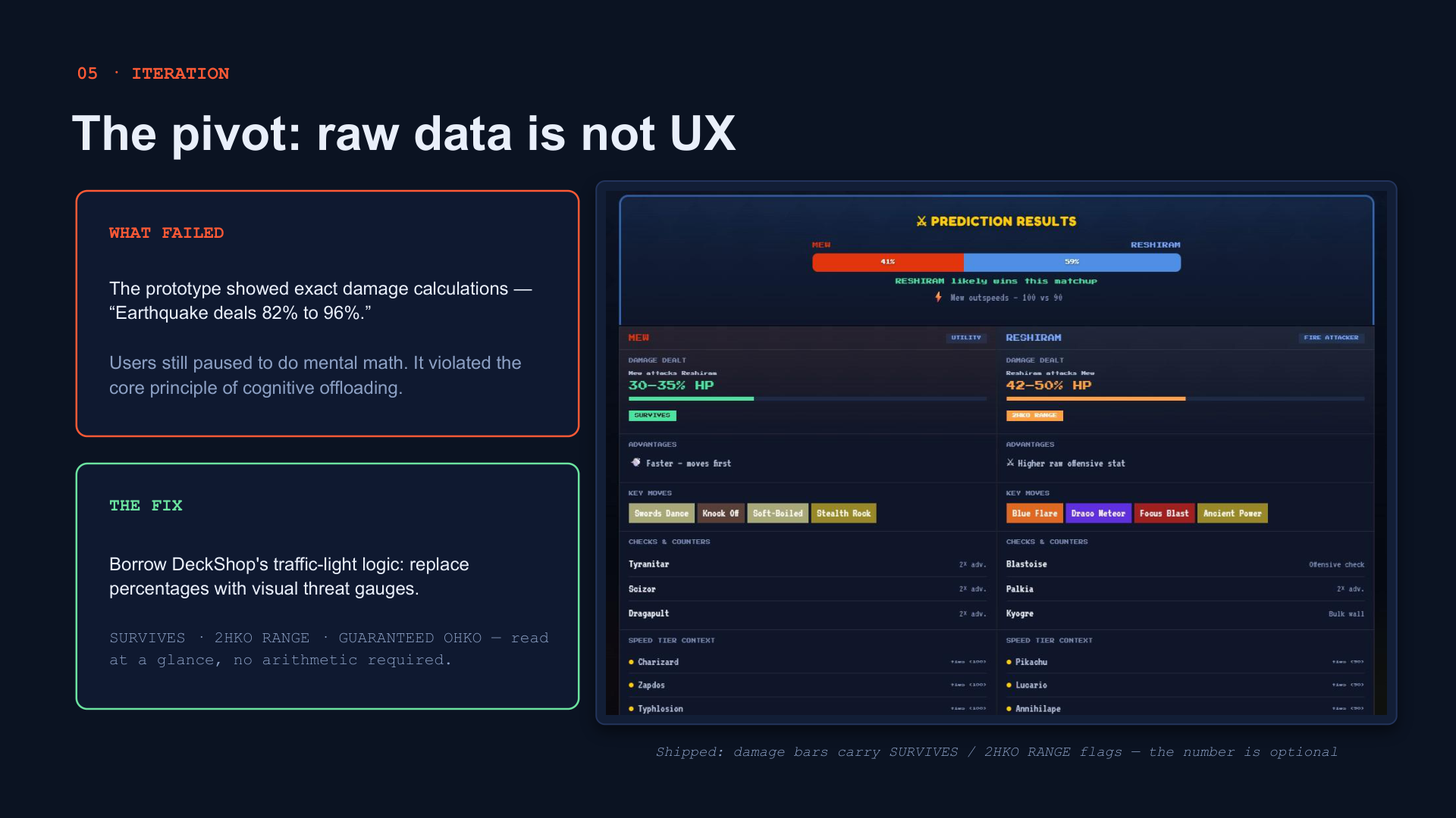
The pivot: raw data is not UX
What failed: exact damage calculations ("Earthquake deals 82% to 96%") — users still paused to do mental math.
The fix: borrow DeckShop's traffic-light logic. Replace percentages with visual threat gauges — SURVIVES · 2HKO RANGE · GUARANTEED OHKO — read at a glance, no arithmetic required.
06 · Understanding
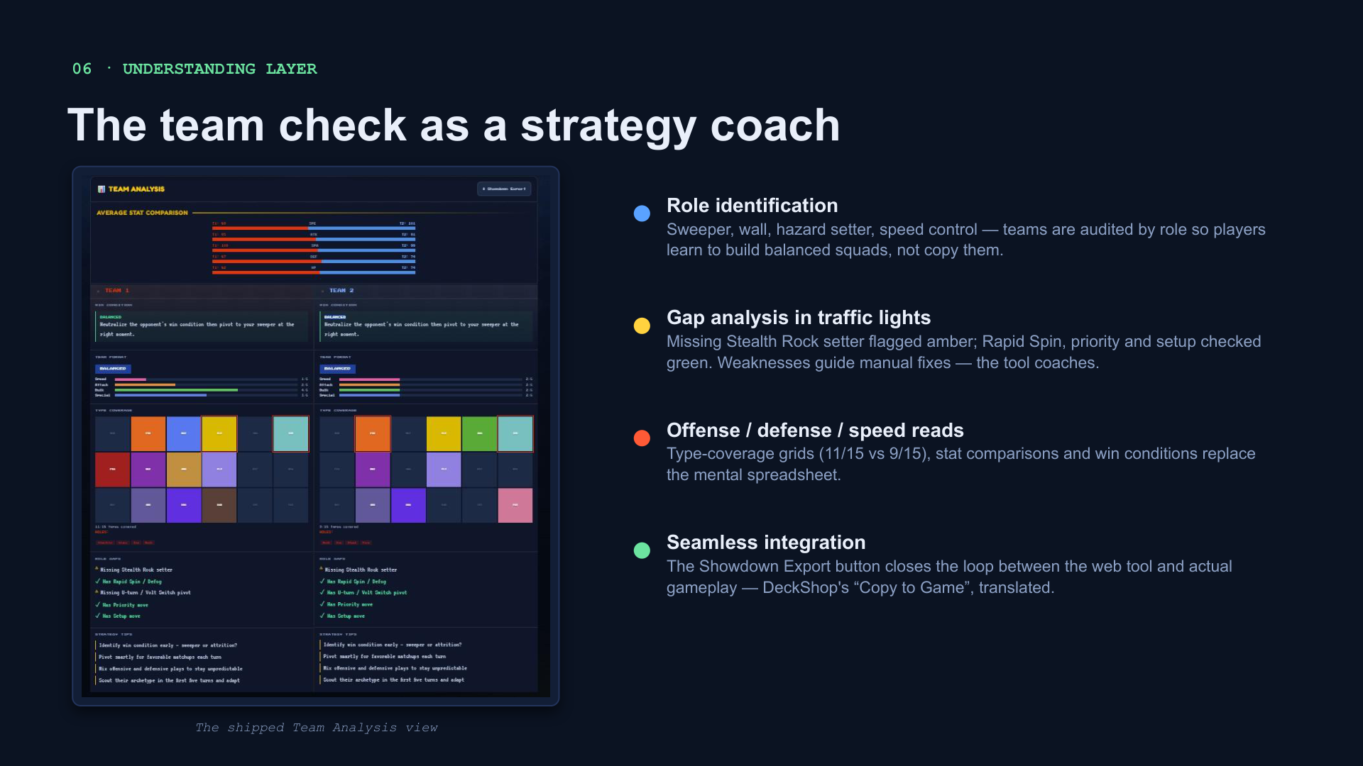
The team check as a strategy coach
- Role identification — sweeper, wall, hazard setter, speed control; teams audited by role.
- Gap analysis in traffic lights — missing Stealth Rock setter flagged amber; weaknesses guide manual fixes.
- Seamless integration — Showdown Export closes the loop between the web tool and actual gameplay.
07 · Depth
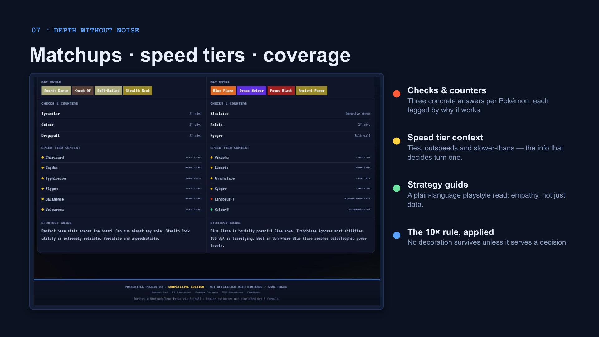
Matchups, speed tiers, coverage
Three concrete answers per Pokémon, each tagged by why it works. Speed tier context — ties, outspeeds, slower-thans — the info that decides turn one. The 10× rule applied: no decoration survives unless it serves a decision.
08 · Impact
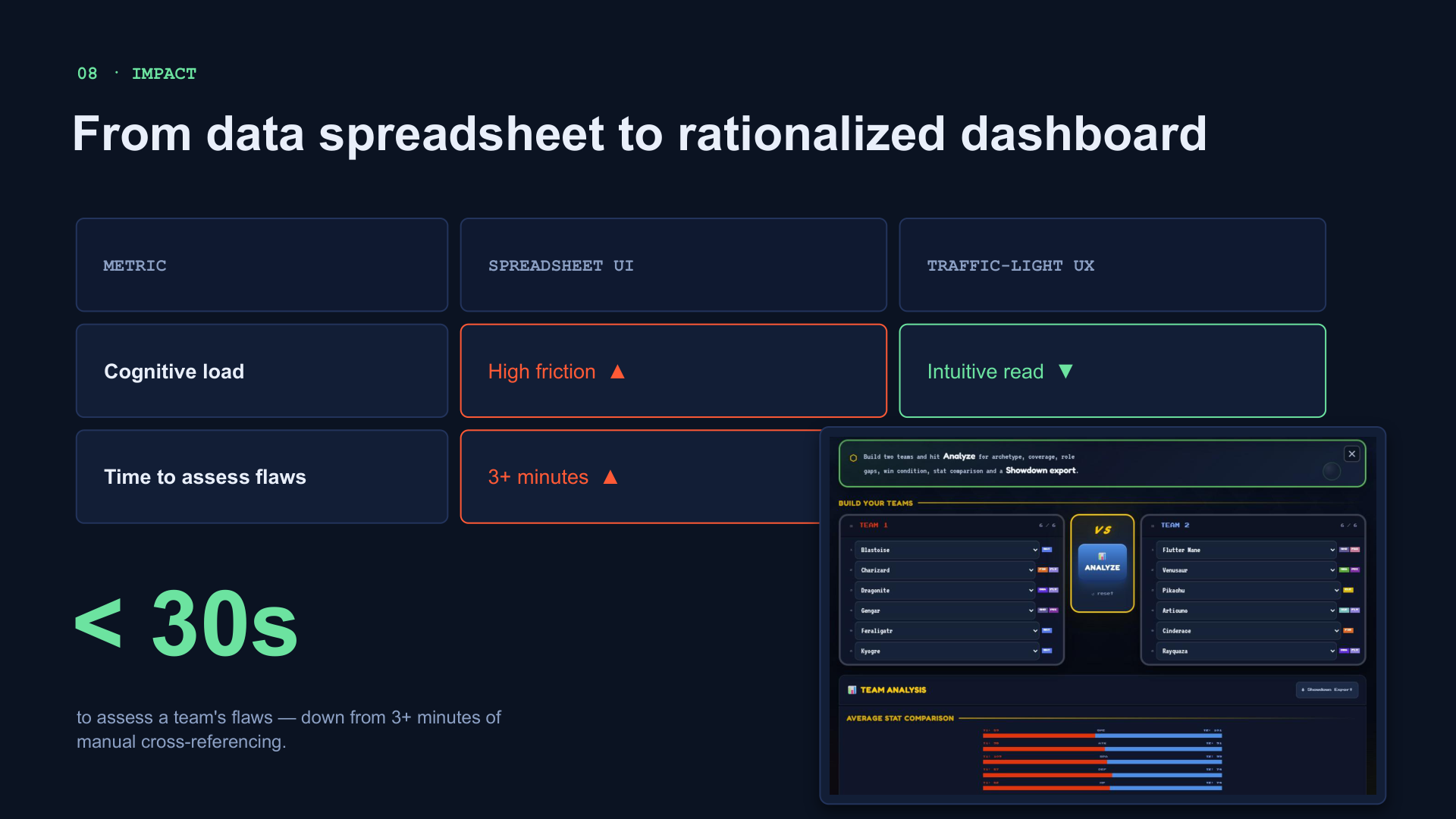
From spreadsheet to rationalized dashboard
| Metric | Spreadsheet UI | Traffic-light UX |
|---|---|---|
| Cognitive load | High friction ▲ | Intuitive read ▼ |
| Time to assess flaws | 3+ minutes ▲ | < 30 seconds ▼ |
Process over pixels. A strong UX case study isn't a visual gallery — it's the story of how evidence justified every single pixel and solved a real human frustration.