Cognitive overload
Competitive Pokémon (VGC / Smogon) has a massive barrier to entry: players track 1,000+ Pokémon, thousands of moves and abilities, and run damage math on the fly — inside timed turns. The existing tools are highly functional but read like 2005 database tables: walls of stat numbers and spreadsheet calculators that cause extreme cognitive overload mid-battle.
The goal: a tool that translates complex math into actionable empathy — showing players why a decision fails, not just the failure itself.
Where I sat in the build
Two players, one timer
The Aspiring Competitor
Knows the games, intimidated by the meta. Wants to try ranked battles but bounces off damage calculators and tier jargon. Needs the tool to teach while it answers.
The Experienced Strategist
Already runs the math — slowly. Wants speed and trust: verify a call in seconds mid-ladder without breaking focus. Needs density without noise.
Structuring the messy middle
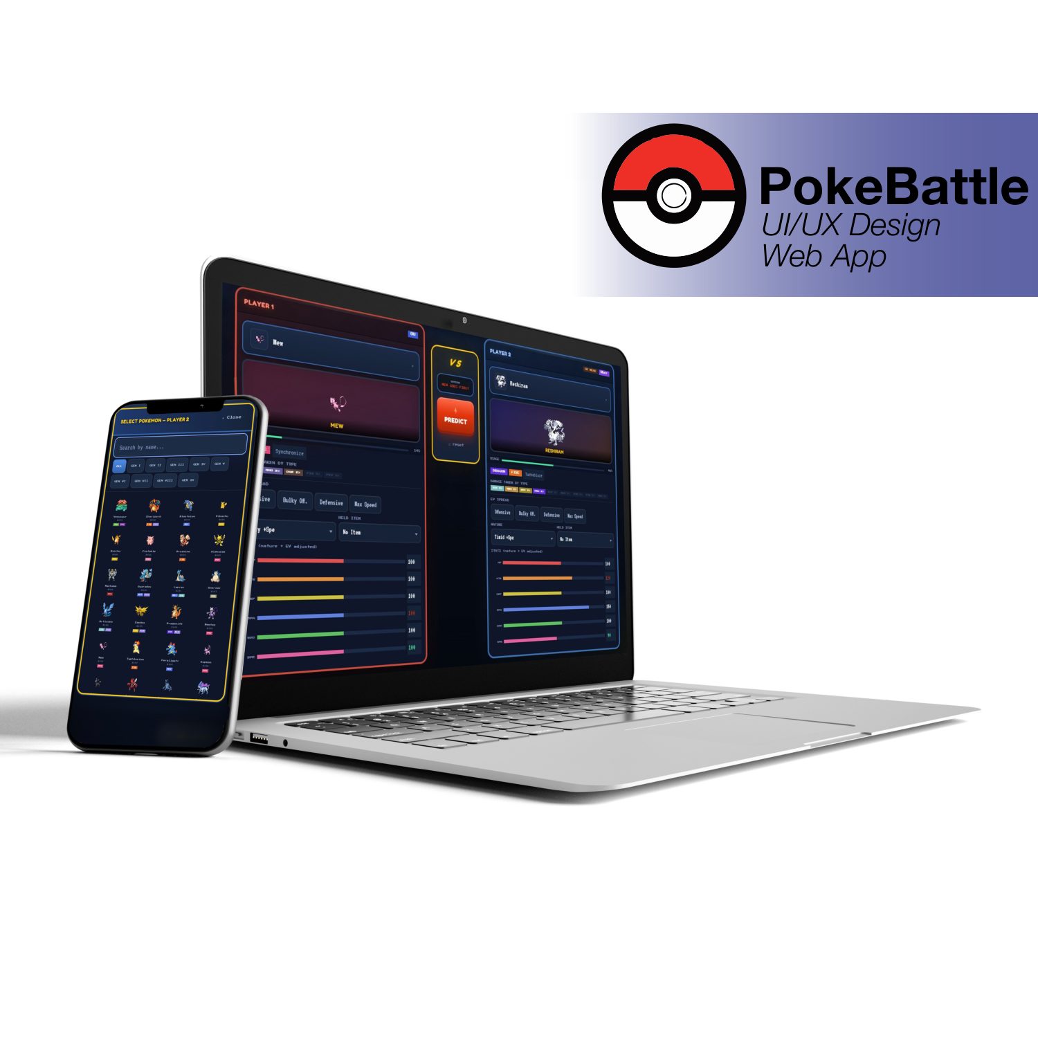
The core flow: a player inputs team data, the predictor runs, and a battle strat comes back. The hierarchy problem was displaying type matchups, speed tiers, and win probability without cluttering a screen someone reads mid-turn. Early layouts that surfaced everything at once — the "dashboard dump" — were discarded: testers scanned past the verdict looking for it. The shipped structure buries nothing but ranks everything: verdict first, evidence beneath, depth on demand.
INPUT
Pick Pokémon; EV presets, natures and items constrain choice before paralysis sets in.
PREDICT
The Python predictor runs matchup math, speed checks and field conditions.
ACT
One verdict bar, threat flags, and the recommended line — readable in seconds.


The secret sauce: logic into glances
My multi-disciplinary edge on this project was translating the backend predictor into glanceable visual cues. The pivot came from usability testing:
WHAT FAILED
The prototype showed exact damage calculations — "Earthquake deals 82% to 96%." Users still paused to do mental math. Raw data is not UX; it violated the whole premise of cognitive offloading.
THE FIX
Distill calculations into color-coded threat levels — green / yellow / red action paths a player reads in under 5 seconds:
SURVIVES2HKO RANGEGUARANTEED OHKO
Two core features


DESIGN HIGHLIGHT
I chose a dark-mode interface to reduce eye strain during long sessions, and used bold, familiar Pokémon type-colors as the labeling system — recognition players already carry does the wayfinding for free.
One turn, three glances
The micro-actions of a single decision: the user inputs the opponent's lead, the predictor calculates the threat, and the tool instantly recommends the safest line.

Closing the loop
What I learned: designing for data-heavy, rapid-decision environments demands strict prioritization of content — the verdict earns the top of every screen, and everything else has to justify its distance from it.
- Live overlay — a compact in-battle companion mode.
- OCR team import — image recognition to auto-import teams from screenshots.
- Responsive mobile — the ladder is played on phones; the strat tool should be too.