Brand Case Study · DSGN 197 · Group 3

Blunity

Blue + Unity — providing clean water for all.

“How can we connect culture and activism within humanity to improve water conditions for those who need it?”

RoleFacilitator · identity, web
TeamCristian · Emily · Azlyn · Anjali · Izzy
YearFall 2024 · BA Senior Project
Blunity brand identity cover — blue ripple wordmark
01 · The problem

Water inequality is a human crisis

2.1B
people still lack access to clean drinking water
2B+
live in water-stressed countries (2021)
60%
of irrigated agriculture faces extreme water stress

Climate change compounds everything: floods push sewage into purification systems, droughts starve communities of supply. The insight that shaped the brand: water is a global issue, but the solutions can be local — the gap isn't awareness, it's connection.

02 · The intention

Five callings, one question

How can we connect culture and activism within humanity to improve water conditions for those who need it?

Group calling intention — refined with our professor

Culture is the doorway; activism is the path. Our research anchored the brand in water's cultural weight — Hindu rivers as deities, Vietnamese water puppetry and creation myths, Meso-American water as sacred agriculture — alongside the sharpest access crises those same communities face.

Blunity concept map connecting humanity, culture, climate change and effects
The concept map: humanity at the center, culture and effects branching out.
03 · Finding the name

Fourteen names, hundreds of marks

Water ReflectsAquarityHydrify The Blue CollectiveBluePulseAquanect AqualumeOshunHenosis Blunity ✓

Blue + unity — the mission is the name: people, gathered around water. Every member sketched marks by hand before anything went digital, hunting for the moment the two words read as one shape. The winning wordmark lets a ripple form the “un.”

Hand-drawn Blunity logo sketch explorations including water rings concept
Sketch explorations — “water rings.”
Final Blunity wordmark — the ripple forms the letters u and n
The final mark.
04 · The identity

One blue, one voice

Simply Money BlueHEX 2EA5DE · CMYK 70:18:0:0 · RGB 46:165:222
32% Blackthe quiet counterweight to the blue
Cabinet Grotesk Bolda single confident sans, wordmark to web · 1.3″ area of isolation
Brandmark specification page: color values and Cabinet Grotesk type specimens
The brandmark spec from the final project book.
05 · The website

From landing to action in one scroll

Four doors, one nav — About Us, Get Involved, Contact Us, Donate — with the ask always one click away. The mission leads: “access to clean water is a basic human right.”

Blunity website landing page
Landing — Blue + Unity.
Blunity About Us page
About — the mission.
Blunity Donate page with preset amounts
Donate — the ask.
Blunity website shown on laptop and phone mockups
Responsive, laptop to phone.
06 · The ripple story

How one gallery becomes clean water

Gallery → Connecting → Activists → Grassroots organizations → Life. The gallery bridges culture and water through stories; shared experience turns visitors into participants; awareness becomes advocacy; Blunity routes that energy to organizations building long-term local water solutions — and better water means stronger communities and opportunity for the next generation.

Ripple story diagram showing concentric stages from gallery to life
The ripple story.
Blunity wishing well artifact design
The wishing-well artifact — connecting community through culture.
Blunity project book cover
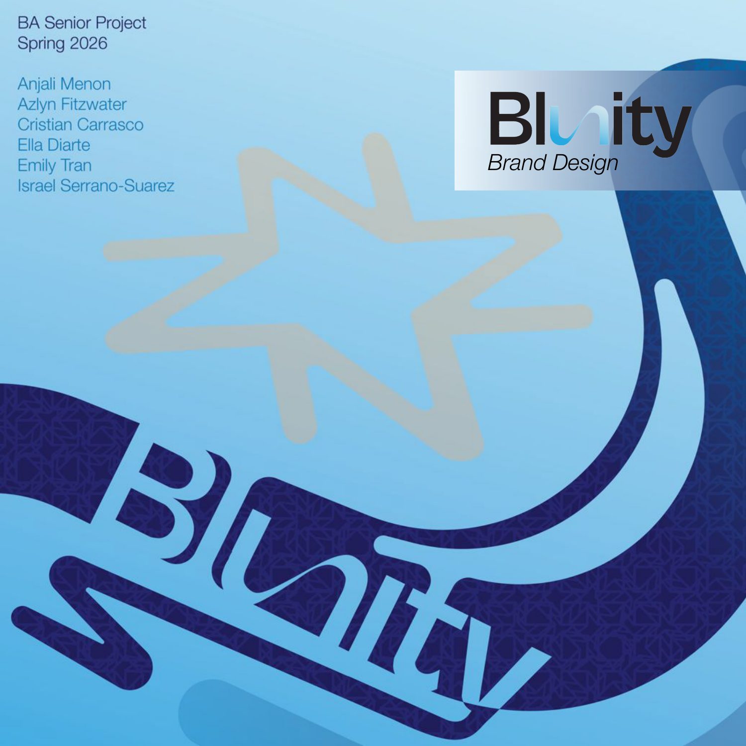
The project book cover.